-
Category: Uncategorised
-
Published: Friday, July 03 2020 09:15
-
Written by Super User
-
Hits: 12137
-
Print
In the second quarter of 2020, the Covid-19 pandemic ravaged the world causing enormous pain, suffering and death.
At the time of writing, around 10 million confirmed cases and 500,000 deaths have occurred worldwide, with more than 25% of those cases and deaths coming from the USA.
Obviously, the disease progresses at different rates depending on the socio-politico-economic conditions at any given location. New York City was particularly badly hit in the early stages, as the virus came in from Europe when everyone was expecting it to appear from Asia. The response from NY has been commendable, and they now have their numbers under control. State responses have varied widely, and this is now showing in the infection rates from those states. We could discuss the politicization of the pandemic with misinformation, radicalization and the influence of the Black Lives Matter movement, but that's a discussion for another day. What I'm concerned about primarily is how the pandemic is progressing in our base state of Vermont.
The Vermont Response
Vermont recognized the potential impact of this disease early and was one of the first to institute a statewide "stay in place" order to attempt to control person to person interactions and therefore viral spread. Like many states, we prepared hospitals for the projected onslaught, created surge capacity by converting large buildings to emergency hospitals and cancelling elective surgeries. The projections at the start of the pandemic were truly horrific, being fed by a lack of knowledge about the virus, its rate and mechanism of transmission and effects on the body of humans in different demographics. As the world struggled to catch up, this knowledge was modified almost daily (sometimes hourly), and plans modified as a result. Luckily, in VT, we didn't get the huge surge of cases and deaths, although the prompt actions of our Governor and his advisors had a lot to do with that.
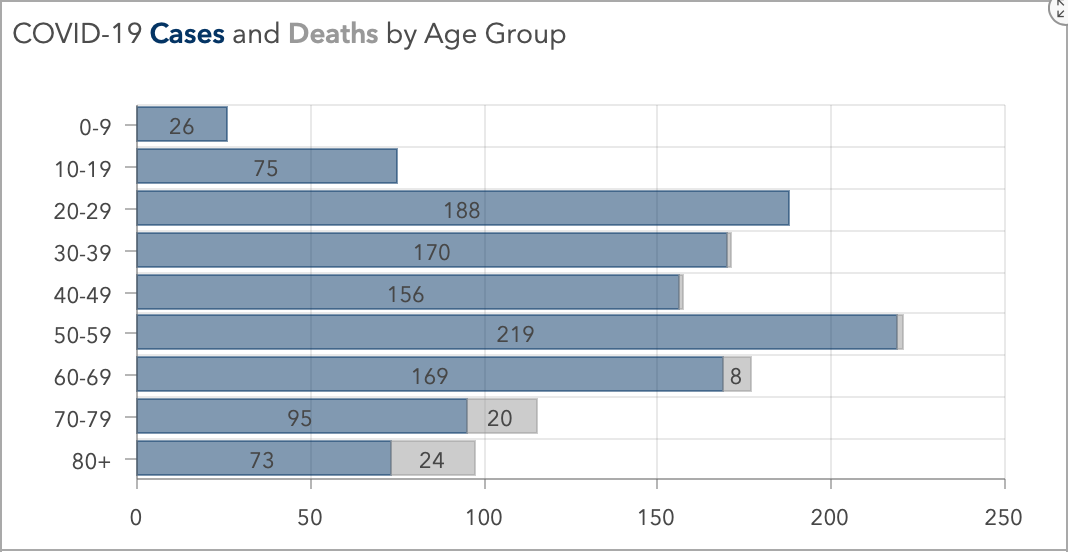
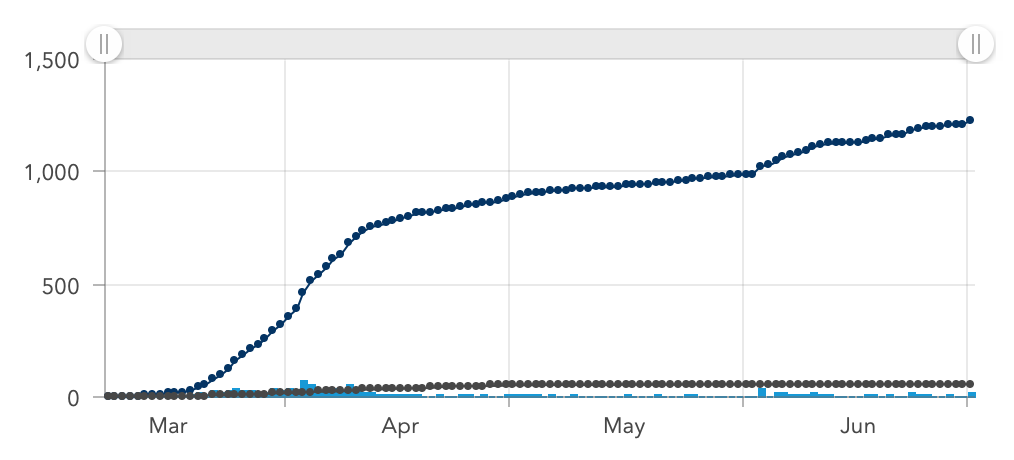
At the time of writing (July 3rd 2020) we have 56 unfortunate souls who have departed this mortal coil through this disease, from 1227 cases. The up to date figures are here.
 |
 |
The Vermont Department of Health (VDH) has done an admirable job of producing clear, easy to understand statistics on the progression of Covid-19.
Unfortunately though, VDH (like most other health departments across the country) have utilized standard run charts to illustrate the progression. These are fine for representing a snapshot of the current situation, but are less useful when attempting to consider the likely progression from this point onwards. For that, we need a vehicle that represents the past data points, produces some kind of range based upon probability and uses both to not just analyze the varying infection rate, but can indicate if any given data point is outside the range of normal variation we could expect, given the prevailing circumstances. In short, we need a control chart.
Predicting the Behavior of a Disease using a Control Chart
The history of the control chart emanates from the world of manufacturing and the works of Walter Shewhart in the 1930's. It has evolved to become a sophisticated and robust method for controlling quality in many situations. The underlying methodology analyzes variance between moving ranges of data points, and produces upper and lower control limits based on formulae, which show the limits within which any given data point will reside ~98% of the time in normal circumstances ("Normal" Variation). It also shows by a series of rules applied to data points when any given data point (or set of data points) is exhibiting behavior that is outside of the normal variation ("Special Cause" Variation). Many good books have been written on this subject, one of the more recent being Measures of Success by my fellow quality scientist Mark Graban. In this book, Mark lays out the history of the control chart, and its application in healthcare fields. It's simple, easy to digest and well recommended by this author.
The Vermont Covid-19 Infection Rate as a Control Chart

This is the progression of the Vermont Covid-19 infection rate from mid April 2020 to present day. You can see the relatively stable starting phase, which was the tail end of the initial surge in cases. The second phase was post lockdown, when almost no-one was moving, working or socializing. The third phase was the discovery of a new cluster of cases in Winooski, and the fourth phase is the progression of mostly day to day infection rates, but with two additional clusters producing spikes also. You can see that in each phase, control limits are calculated which define the range of normal variation. In the third phase, these are very wide. In the second phase, narrow. In the world of quality science, we use these ranges to indicate if a variable is in or out of control.
This method has its limits though. It is not a panacea or magic bullet. Its main purpose is to show when any given data point warrants an investigative or corrective response. The rules I mentioned previously govern which points should be investigated and which should not be. The Infection Rate is the output of a complex system (the world), with multiple variables affecting the rate in simple and complex ways. In the quality world, we would use this to indicate when corrective action was necessary and then instigate investigations into root causes for potential improvement using fishbone diagrams, driver diagrams and other tools. I would like to think that someone is going down this pathway with the Covid-19 infection rate in VT, but I have seen no evidence of that.
Conclusions
Using a control chart rather than a straight run chart to represent the Covid-19 Infection Rate is more useful to the public and epidemiologists alike, as it shows not just the point to point progression, but also the severity of variation between points and therefore, if corrective action should be undertaken. It provides the data against the often expressed sentiment of "The rate is down to Zero! We've done it! We've controlled the Infection rate! Everyone back to work, socializing, normality". It shows that any given data point exists not in isolation, but in the latest of a sequence of outputs from a constantly varying complex system, governed by rules. Those rules can be used to show if any given data point needs to be investigated further, and more to the point, if it DOESN'T need investigating further. I hope to see the use of this tool expand in health departments nationwide. In the meantime, I'll continue to keep this chart up to date and post on this site.
If anyone needs clarification on anything in this article, please contact me at This email address is being protected from spambots. You need JavaScript enabled to view it.
-
Category: Uncategorised
-
Published: Tuesday, February 18 2020 17:44
-
Written by Super User
-
Hits: 7240
-
Print

Bryan Research has developed several advanced capabilities in our time in existence. These cross over vertical markets, and are listed here.
Surveys.
We are skilled at the design, creation, execution, analysis and reporting of online surveys. We can do them for any scale from a small, 5 question straight survey through to a 100 question, multi conditional branched survey.


